Craigslist Mobile Redesign

TEAM MEMBERS
Christina Barcus UX/UI Designer
Amy Kim UX/UI Designer
Elaine Jacinto UX/UI Designer
MY ROLE
Conception
User Research
Wireframes & Prototypes
Design System
User Testing
TOOLS
Adobe XD
Photoshop & Illustrator
InVision and FlowMapp
2020
The Problem
There’s an overwhelming amount of information and lack of hierarchy of content that can be daunting for users. Our users don’t feel a sense of security due to lack of legitimacy and regulations of posts by potential scammers with no consequence. This results in users seeking alternate sources that better serve their needs.
Additionally, they don’t offer a competitive and up-to-date mobile application.
Research
Statistics pulled from EMarker state in 2019, for the first time, US consumers spent more time on their mobile devices than they do watching TV, and 90% of that time is spent on apps.
Another site similar to Craigslist called OfferUp was downloaded more than 80 million times in 2019.

User Insight
“I think it’s sketchy because there are a lot of scammers on the site. I’ve almost been scammed a couple of times.”
“I hate how flakey buyers and sellers are on Craigslist. So hard to communicate efficiently.”
“Craigslist isn’t trustworthy; all you ever hear is how people were scammed.”
Identifying user needs
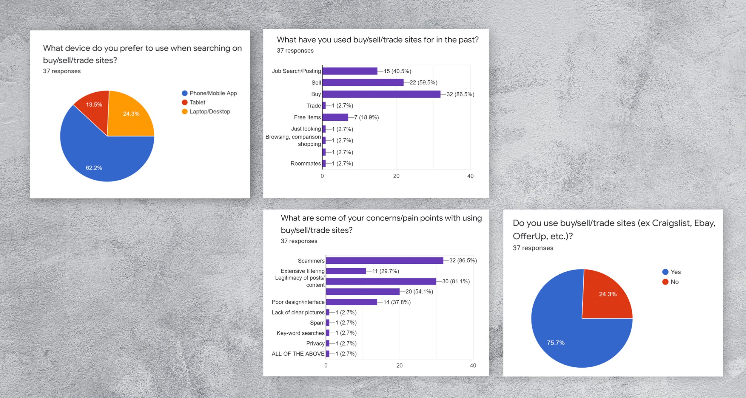
The key takeaways from the user interviews was that a high percentage of users have used Craigslist or a site similar to it. Users were wary of using Craigslist because there was potential to be scammed and using the site tended to be time consuming because you were constantly fishing through numerous posts trying to weed out the fakes.
User Persona

Competitor Analysis
The most direct competitors with Craigslist were OfferUp (formerly known as LetGo), Amazon, and Facebook Marketplace. A common thread between all of the competitors was that there were more security measures for both buyers and sellers as well as extensive filtering and opportunity to customize your experience.

Our analysis of the websites was that there were far more security measures that were implemented to protect both buyers and sellers. The opportunity to have a verified profile that linked to your account created less distrust as well as a safer environment for users. The extensive filtering options on all of the sites reduced the number of listings and therefore increased user efficiency when locating listings that were closely matched to their criteria. The usage of push notifications/alerts for specific products also added value to the user experience because the user wasn’t limited to the listings shown on their first visit but also given the chance to be notified of later listings that also matched their criteria.
The Solution
Designing an updated mobile application for Craigslist that helped users feel safer, more secure, and free of scammers. These features will reduce potential scammers on the site and enforce legitimacy of posts which in turn will result in and increase of brand loyalty where users feel protected, safe, and more inclined to use the new Craigslist app over other platforms.
streamlining content
Streamlining the hierarchy of content to filter the amount of information presented. This will help users be more efficient and save time.
implement a ratings system
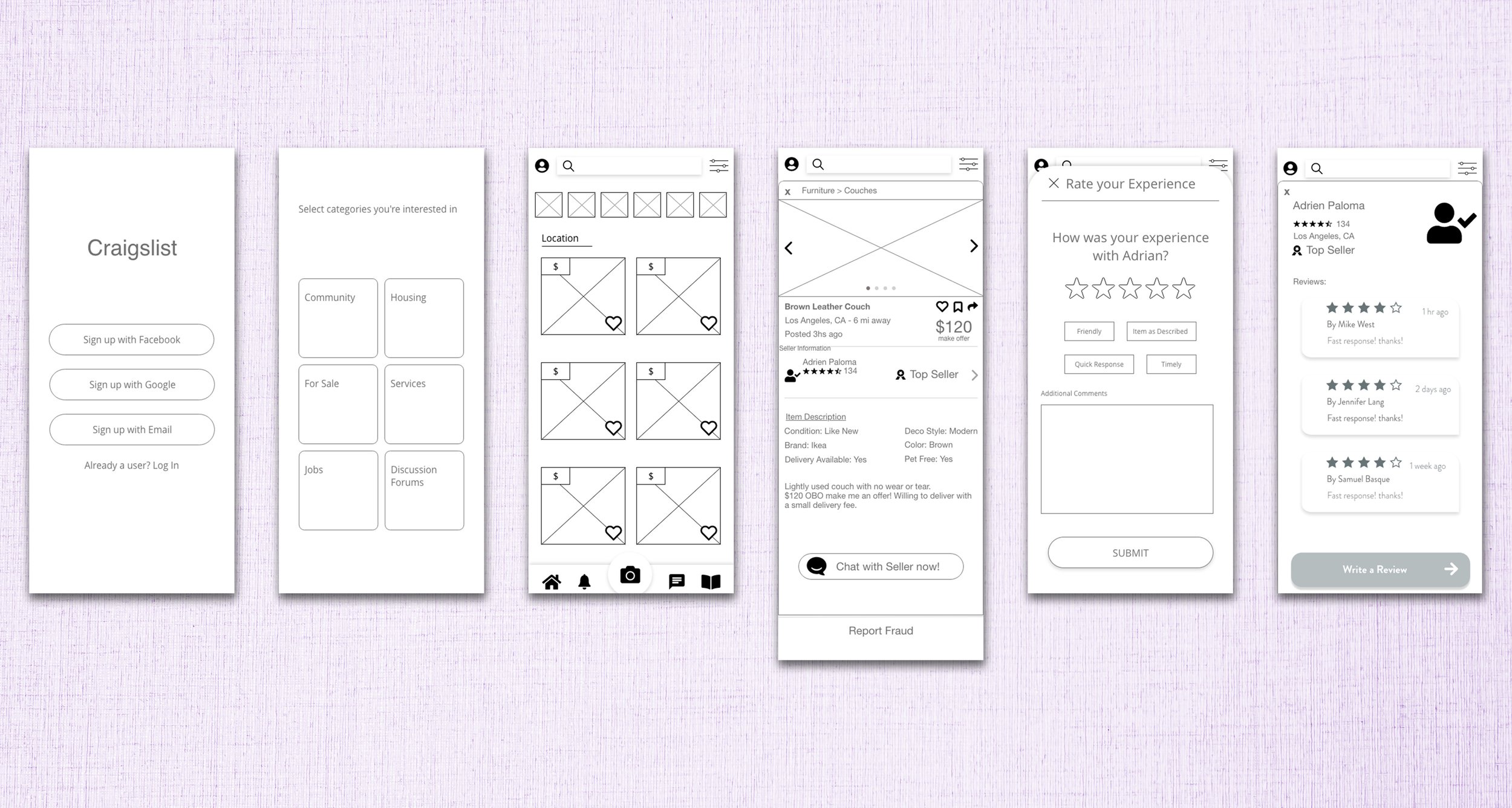
Implement a ratings system that enables both buyers and sellers to give feedback based on their personal experiences with other users. This will be featured on users profiles that will be displayed for other users to view.
report fraud
A feature that allows users to report fraud. This covers any suspicious or fraudulent behavior/activity for both seller’s or listings.
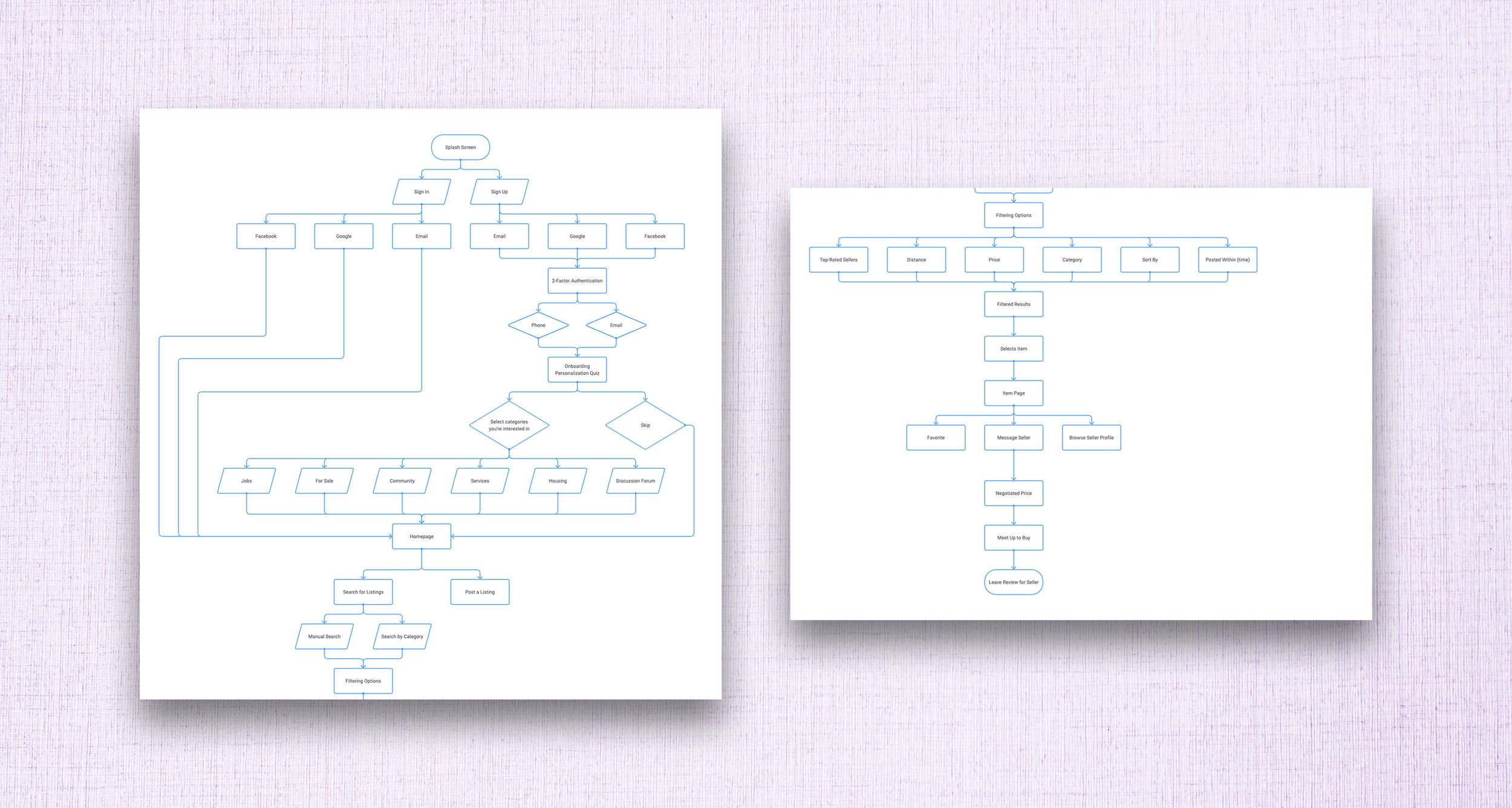
user flow

Lo-Fidelity Wireframes

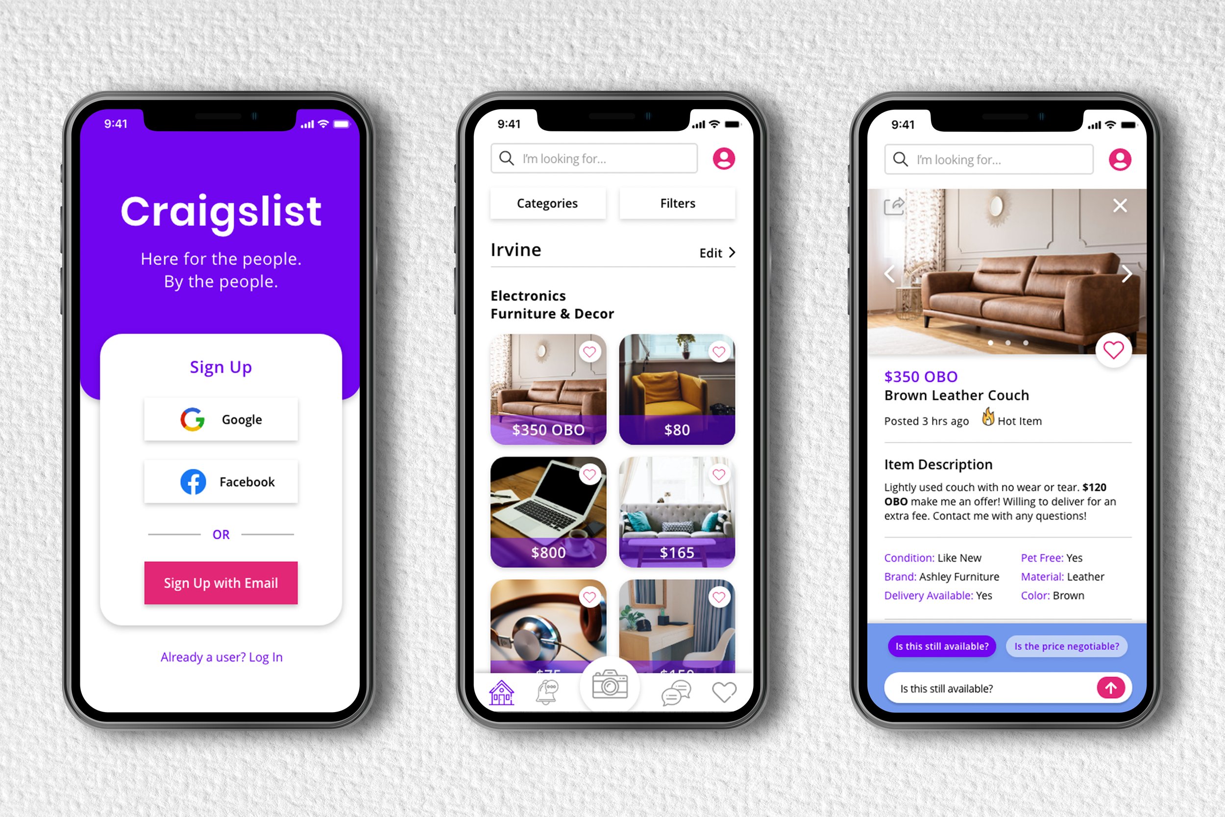
Hi-Fi Wireframes

Final Prototype
