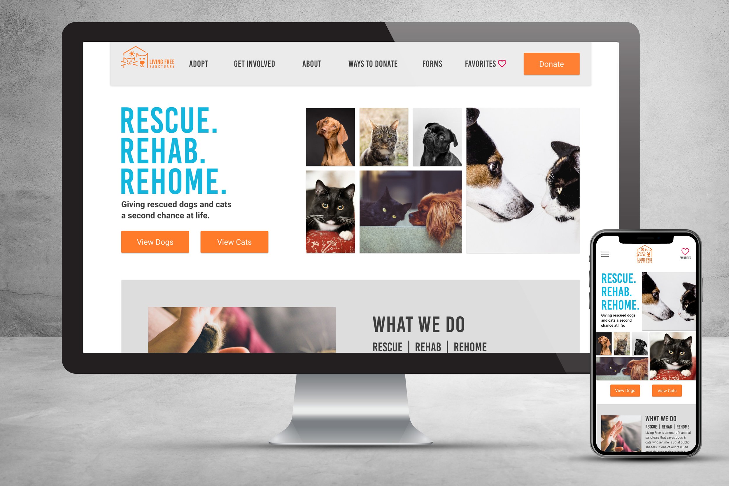
Living Free Animal Sanctuary Redesign

TEAM MEMBERS
Christina Barcus UX/UI Designer
Angelica Hernandez UX/UI Designer
Katherine Chung UX/UI Designer
Sara Boukai UX/UI Designer
Tools
Adobe XD
Photoshop & Illustrator
InVision and FlowMapp
2020
My Role
Conception
User Research
Wireframes & Prototypes
Design System
User Testing
The problem
Users struggled with identifying the key differences between animal sanctuaries and animal shelters. Since sanctuaries never euthanize the animals they take in, they’re monetarily responsible for the animals for the rest of their life, or until they’re adopted out. Many of the animals taken to these sanctuaries need to be rehabilitated and require extensive medical care, as well as housing and food for their stay whether it be for months or years.
Research
79% of users surveyed ranked their knowledge of sanctuaries as a 3 or less on a scale of 1-5 (1 = no knowledge 5 = expert knowledge).
73% of users surveyed said when considering getting a pet looked at animal shelters and sanctuaries before other sources.

user insight
“I don’t know anything about sanctuaries unless they’re similar to what a rescue is...”
“Familiar with sanctuaries? Not much honestly, but I’m familiar with the SPCA.”
“I have no idea. Is it like a pet haven? If so, I am aware of them but do not know much about them.”
identifying user needs
From the initial user interviews and survey data it was apparent that the majority of users weren’t familiar with the differences between an animal sanctuary and an animal shelter. From that same data we were also able to find that users were more likely to donate to a good cause if it was easy to do.
user persona

competitor analysis
The most direct competitors of Living Free Animal Sanctuary were shelters, pet stores, and breeders. We selected some of the top companies including the ASPCA, PetSmart, and the American Kennel Club.
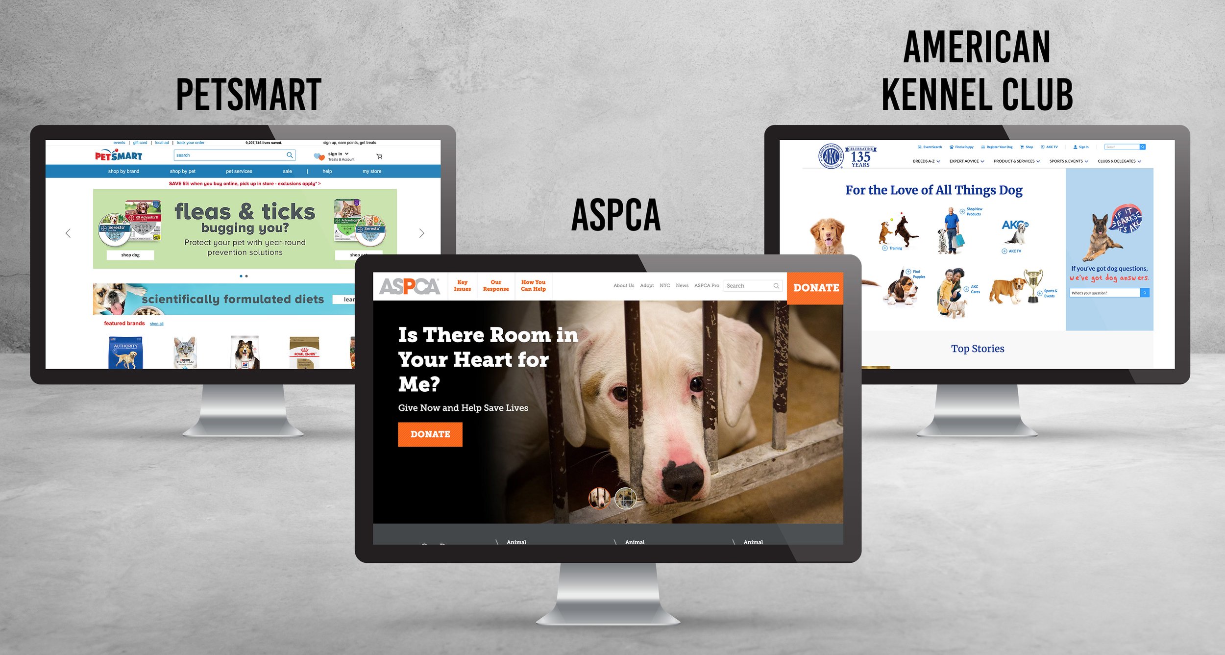
Our analysis of the competitor websites was that there was a clear call to action on the homepages of each website. The ASPCA website did a great job of using compelling imagery accompanied by strong messaging and color to send a message that action needed to be taken in order to help the animals that couldn’t help themselves. Their adoption page along with PetSmart’s was easy for users to locate and direct themselves to. The purpose of each of these websites was very apparent and we wanted to introduce some of these elements into the redesign for the Living Free Animal Sanctuary.
The solution
Focus on donating to LFAS as well as adopting from them in order to make room for more animals in need of the sanctuary’s services. The site will be an inviting and informative user experience that engages and motivates users and prospective pet owners to donate, foster, volunteer or adopt from Living Free Animal Sanctuary.
Clear CTA
Make the donate button large and colorful so users can’t miss it when landing on the homepage. This will get more users to easily navigate to the donate page and make donations to help out the sanctuary.
Hierarchy of Info.
Streamline information presented on the website and create a better hierarchy of content so users can more easily navigate through everything the website has to offer.
Make contact info. more prevalent
Make it easier to contact the sanctuary about potential visits, as well as information about fostering and volunteering.
clearer paths to donate and adopt
Make it easy for users to donate as well as see available animals up for fostering and adoption. Also creating fun and enjoyable dog bios that tell the personality of the animal for best suitability.
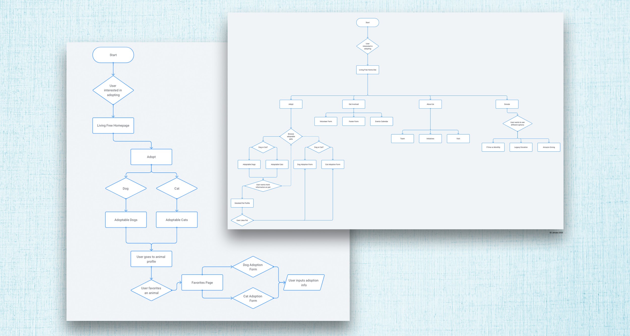
user flow
sketches - conception of prototype
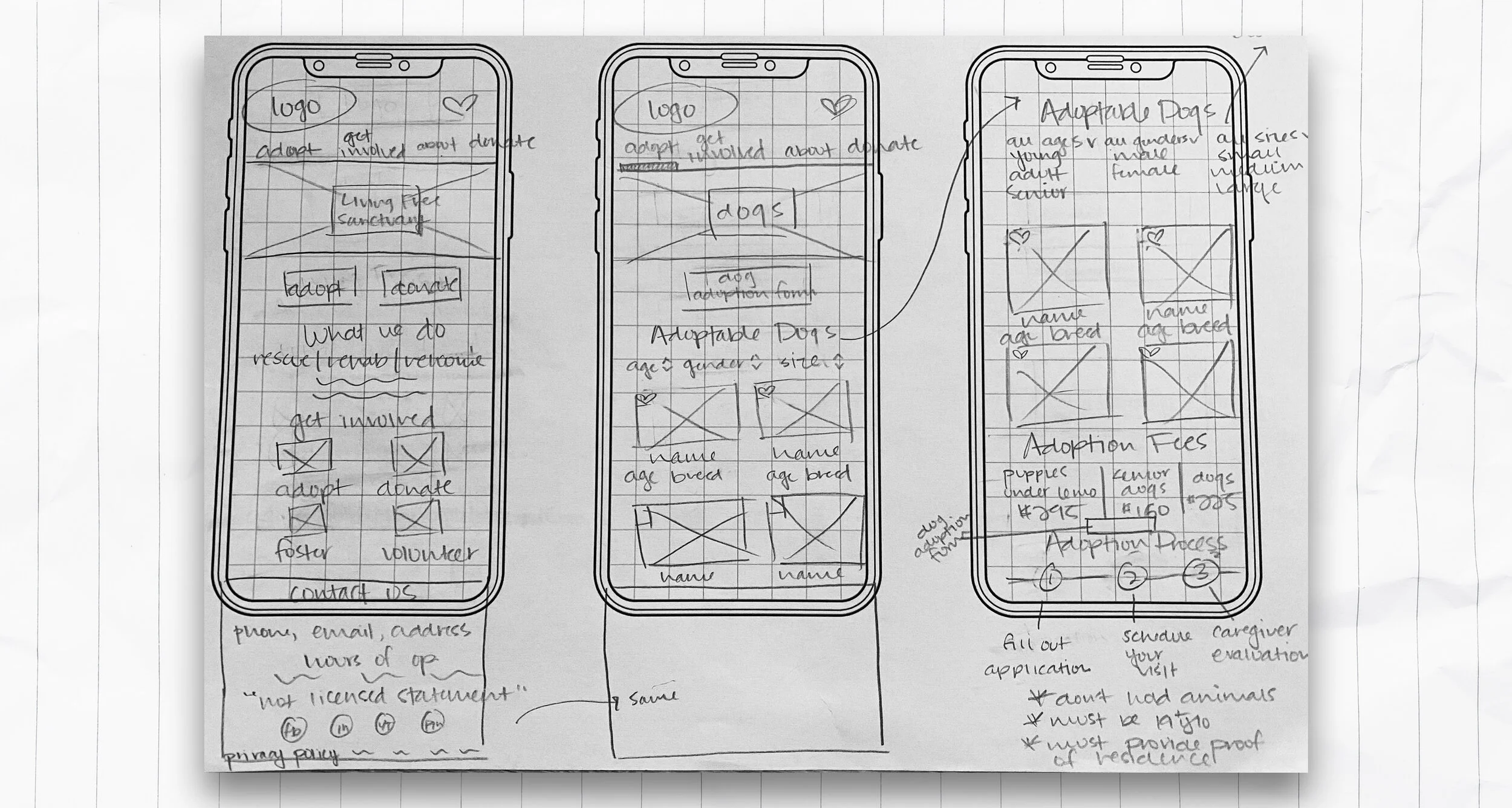
Lo-Fidelity screens
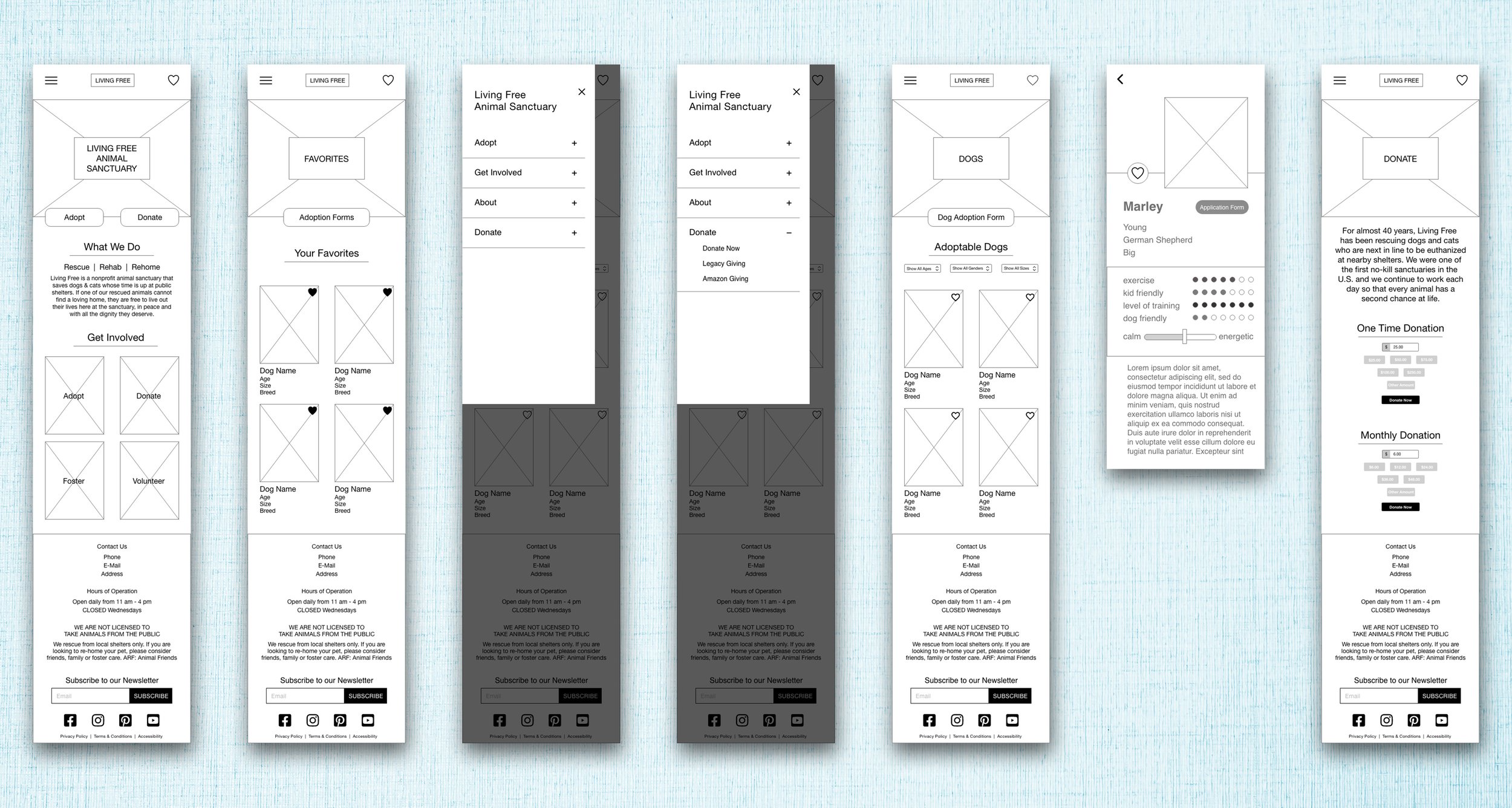
MOBILE Hi-fidelity screens
DESKTOP Hi-fidelity screens

final prototype
